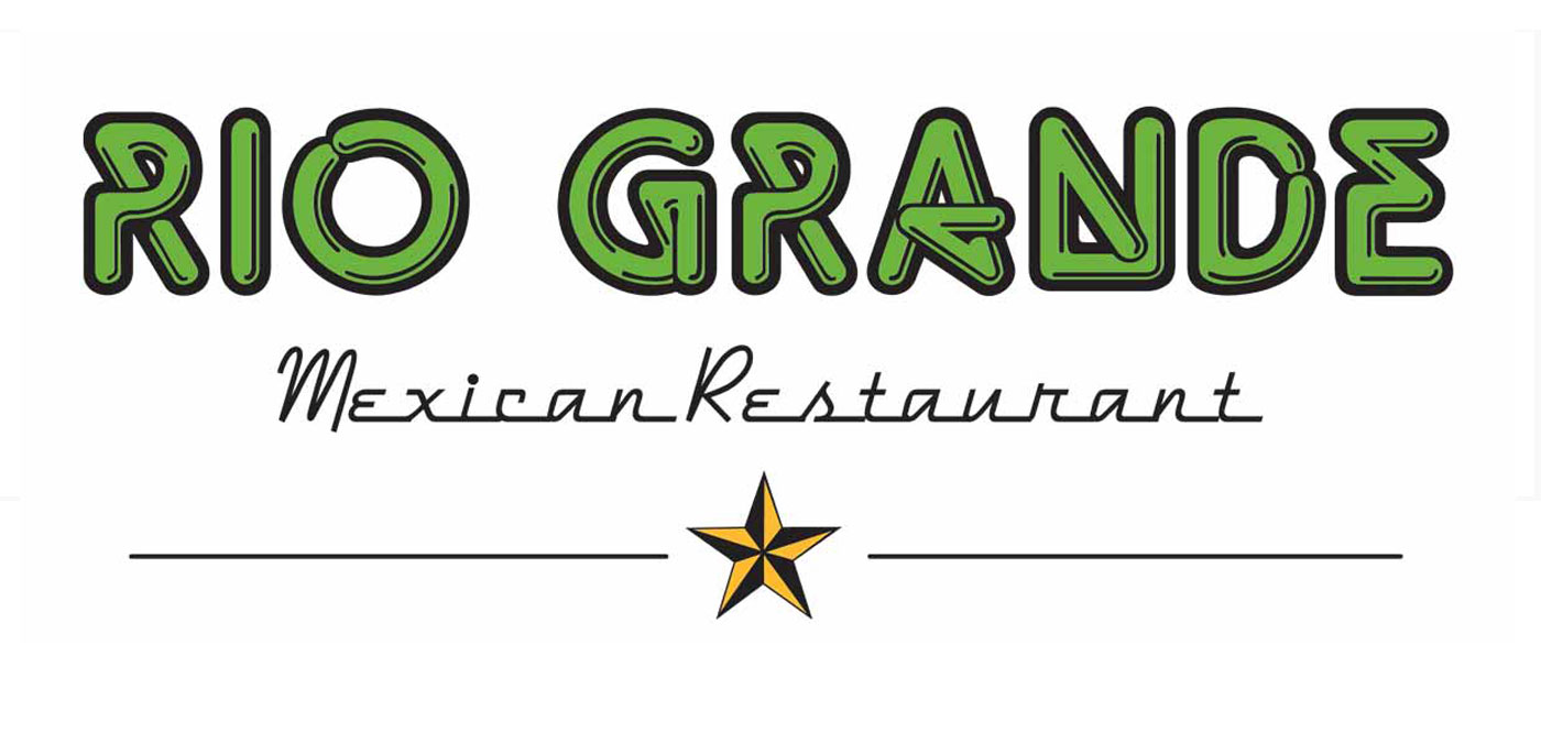
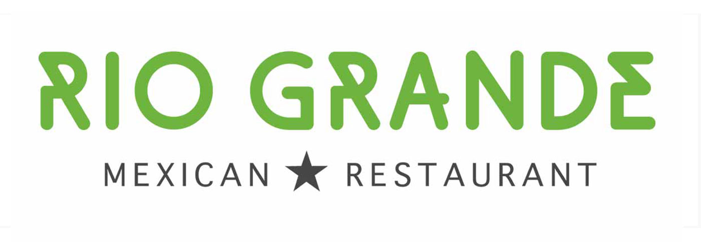
Rio Grande Mexican Restaurant Logo Redesign Refresh
A logo redesign project turns into a modest logo refresh when the real pain point is exposed.
In 2013 Fusionbox was contracted to redesign the website for the Rio Grande Mexican Restaurant. In fact, the client was doing a complete rebranding effort because their current logo did not play well on the different digital platforms. During the design process however, there were some challenges getting complete buy-in on the new logo.
I may be an anomaly here, but even as a designer I don’t always believe that a logo redesign will always be the best solution. I proposed to my Project Manager to sketch out a simplificaton of their existing logo instead, which she agreed to.


With Boulder based Grenadier overseeing the efforts, the final result was a simplified, legible version of their original logo that would work on print and digital while preserving the majority of its rich brand history.
Post project completion, Grenadier has done a great job on the brand development of this Colorado icon.
Credits:
Client: Rio Grande Mexican Restaurant
Designer: Esther Ball-Babois (under contract of Fusionbox - Denver, CO)
Art Direction: Grenadier - Boulder, CO
Identity Development
