Home Work

Youth Non-Profit Promotional Flyers

How we produced the best flyers on the smallest of budgets for this Amsterdam based non-profit.

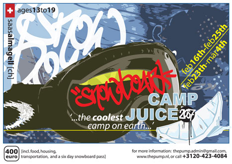
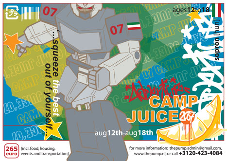
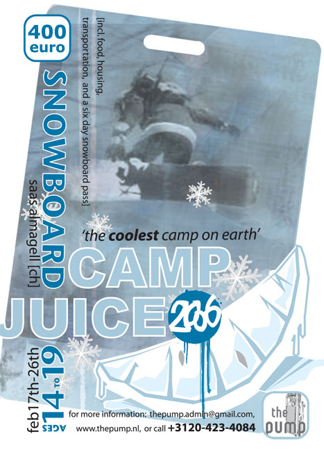
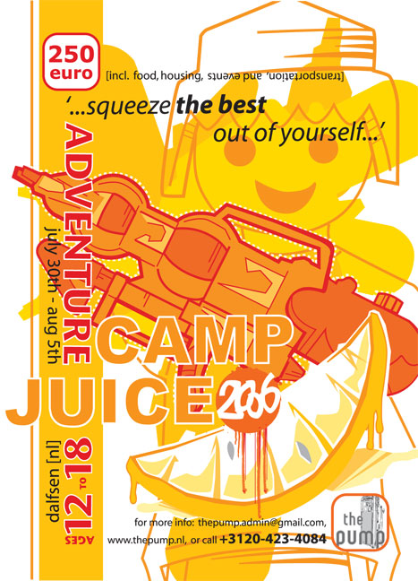
To promote their annual summer and winter snowboard camps, this Amsterdam based non-profit would produce promotional flyers. Together we challenged ourselves to get to best looking flyers on the smallest of budgets.

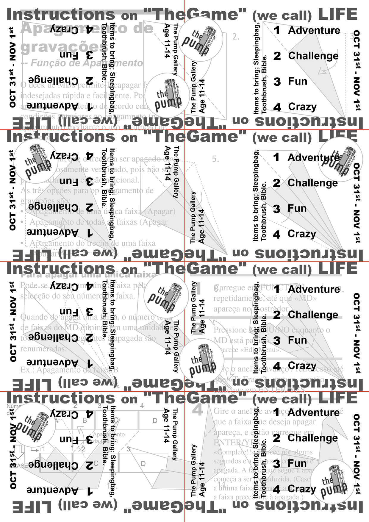
To get as many flyers as possible on a very low budget, I placed the designs strategically to fit as many flyers as possible on a standard A4 sized sheet of paper. Copied in black and white on an office photo-copier.

Rio Grande Mexican Restaurant logo refinement - before
Gallery Camp'04 This placement allows 8 flyers on one A4 sheet.
Rio Grande Mexican Restaurant logo refinement - after
Camp Juice Snowboard Camp'04 This placement allows 4 flyers on one A4 sheet.

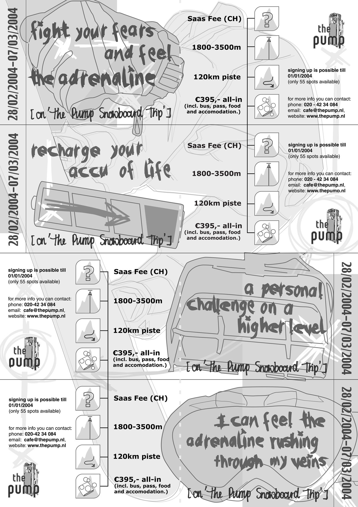
By now we have a slight bigger budget to get the flyers printing digitally. By printing the summer camp on one side and the winter camp on the other, we can print twice as many flyers for the same price.

Rio Grande Mexican Restaurant logo refinement - before
Camp Juice Snowboard Trip'07 features cooler colors to promote their snowboard trip to Saas Almagell, Switzerland.
Rio Grande Mexican Restaurant logo refinement - after
Camp Juice Adventure Camp'07 features warmer colors to promote their summer camp, in Dalfsen, the Netherlands.
Rio Grande Mexican Restaurant logo refinement - after
Camp Juice Snowboard Trip'06 features cooler colors to promote their snowboard trip to Saas Almagell, Switzerland.
Rio Grande Mexican Restaurant logo refinement - before
Camp Juice Adventure Camp'06 features warmer colors to promote their summer camp, in Dalfsen, the Netherlands.

Credits:

Client: The Pump [Amsterdam, The Netherlands]
Designer: Esther Ball-Babois

Visual Design Brand Development